
Choosing the Right Wall Art Size for Your Space (Most People Get This Wrong)
If your home still feels “unfinished” even after decorating, the problem is rarely color or furniture.
It’s scale.
The number one mistake people make when buying wall art is choosing pieces that are far too small for the space. Undersized artwork breaks visual balance, making even a well-furnished room feel awkward and disconnected.
Designers don’t guess sizes. They follow proportion rules — and once you know them, choosing the right piece becomes easy.
1. The 60–75% Rule (The Golden Formula)
When hanging art above furniture, your artwork should cover about 60–75% of the furniture width.
Example:
-
Sofa width: 84 inches
-
Ideal artwork width: 50–63 inches
Anything smaller will look like it’s floating.
Anything larger can overpower the room.
This single adjustment instantly makes a space feel professionally styled.
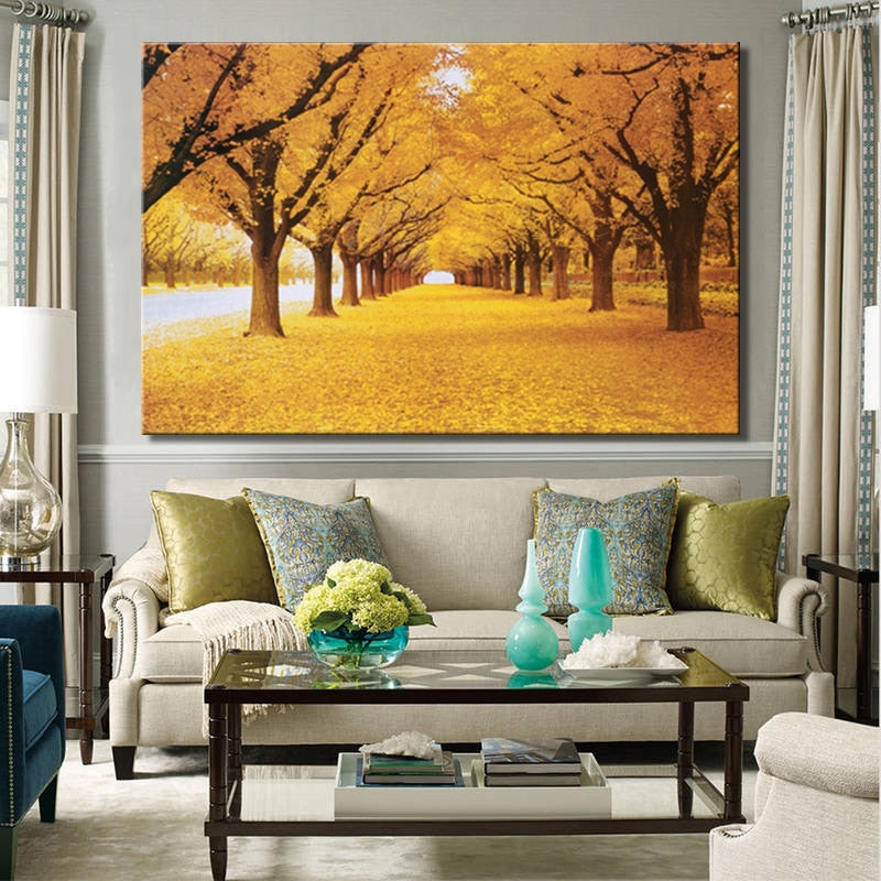
2. Bigger Rooms Need Bolder Scale
Large walls require visual weight to feel balanced.
Many homeowners try to “play it safe” with medium-sized art — but safe often reads as underwhelming.
In open-plan living rooms, oversized wall art:
-
Grounds the seating area
-
Makes ceilings feel higher
-
Reduces the need for excessive decor
-
Creates a clean, modern statement
In design, confidence always looks better than hesitation.
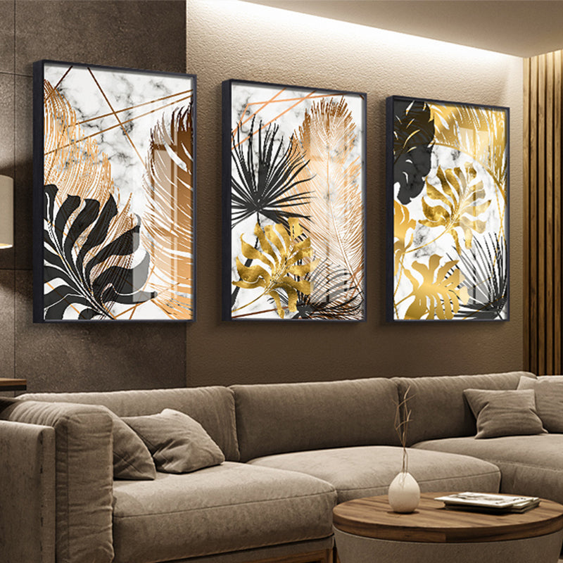
3. One Large Piece Works Better Than Many Small Ones
Gallery walls can be beautiful — but they are harder to execute and easier to get wrong.
A single large canvas:
-
Creates clarity
-
Feels architectural rather than decorative
-
Keeps the space calm and intentional
-
Requires less styling around it
That’s why many modern interiors rely on statement-scale artwork instead of multiple frames.
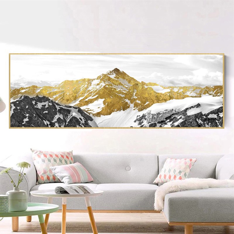
4. Consider Viewing Distance
Art isn’t just about wall size — it’s about how far away you experience it.
If you typically view the wall from across the room, small details disappear. Larger compositions read better and create emotional impact from a distance.
Think of wall art the way you think about a stage backdrop, not a tabletop object.
5. Let the Wall Breathe Around the Art
Correct sizing doesn’t mean filling every inch.
Leave 6–10 inches of negative space around the artwork so it feels framed by the architecture. This breathing room is what gives large-scale art its gallery-like presence.
6. Vertical vs. Horizontal: Match the Room’s Shape
Choose orientation based on what you want to enhance:
-
Horizontal pieces → widen the room visually (ideal above sofas or beds)
-
Vertical pieces → emphasize ceiling height (great for narrow walls)
-
Square formats → create balance in modern layouts
When art echoes the proportions of the space, harmony happens naturally.
Why Size Matters More Than Style
People spend weeks choosing colors and patterns — but proportion is what actually determines whether something looks “right.”
You can choose almost any aesthetic.
But if the scale is wrong, the room will still feel off.
Get the size right first. Style comes second.
Ready to See What the Right Scale Looks Like?
If you're unsure what size works best for your space, start by exploring large-format pieces designed specifically for modern interiors.
At SallyHomey, collections are created with real-room proportions in mind — so you can visualize how statement-scale artwork transforms a wall from empty to intentional without overwhelming it.
Whether you're styling a compact apartment or an open living area, choosing the correct dimensions is often the fastest upgrade you can make.
Explore size-forward wall art collections to see how scale changes everything — or read more guides to plan your space with confidence.
Next in this series: Minimalist Wall Decor Ideas That Make Small Spaces Feel Bigger.