
How to Choose Wall Art That Matches Your Interior Style (Without Overthinking)
One of the biggest fears people have when buying wall art is:
“What if it doesn’t match my home?”
The truth is, you don’t need to be an interior designer to get it right.
You just need to understand how your space already behaves — and choose art that supports it.
Here’s a simple way to match wall art to your interior style without guesswork.
Step 1: Identify Your Room’s Dominant Mood
Before choosing art, look at what already exists:
-
Are your colors mostly neutral?
-
Do you have clean lines or decorative details?
-
Is the space calm, bold, cozy, or structured?
Your wall art should reinforce that mood — not fight against it.
Art works best when it echoes the room, not competes with it.
Step 2: Match Style to Structure (Not Just Color)
Most people try to match wall art only by color.
But structure matters more.
Ask:
-
Is your furniture sleek and modern? → Choose abstract or minimalist art.
-
Are shapes soft and natural? → Choose organic, nature-inspired pieces.
-
Is the room bold and architectural? → Choose high-contrast or geometric compositions.
When structure aligns, color matching becomes easy.
Step 3: Use the “Same Language” Rule
Think of your interior as speaking a visual language.
Your art should speak the same language:
-
Minimalist rooms → Simple compositions with negative space
-
Contemporary homes → Balanced abstract forms
-
Scandinavian interiors → Soft tones and natural inspiration
-
Modern spaces → Clean, confident focal pieces
You don’t need identical elements — just consistency in tone.
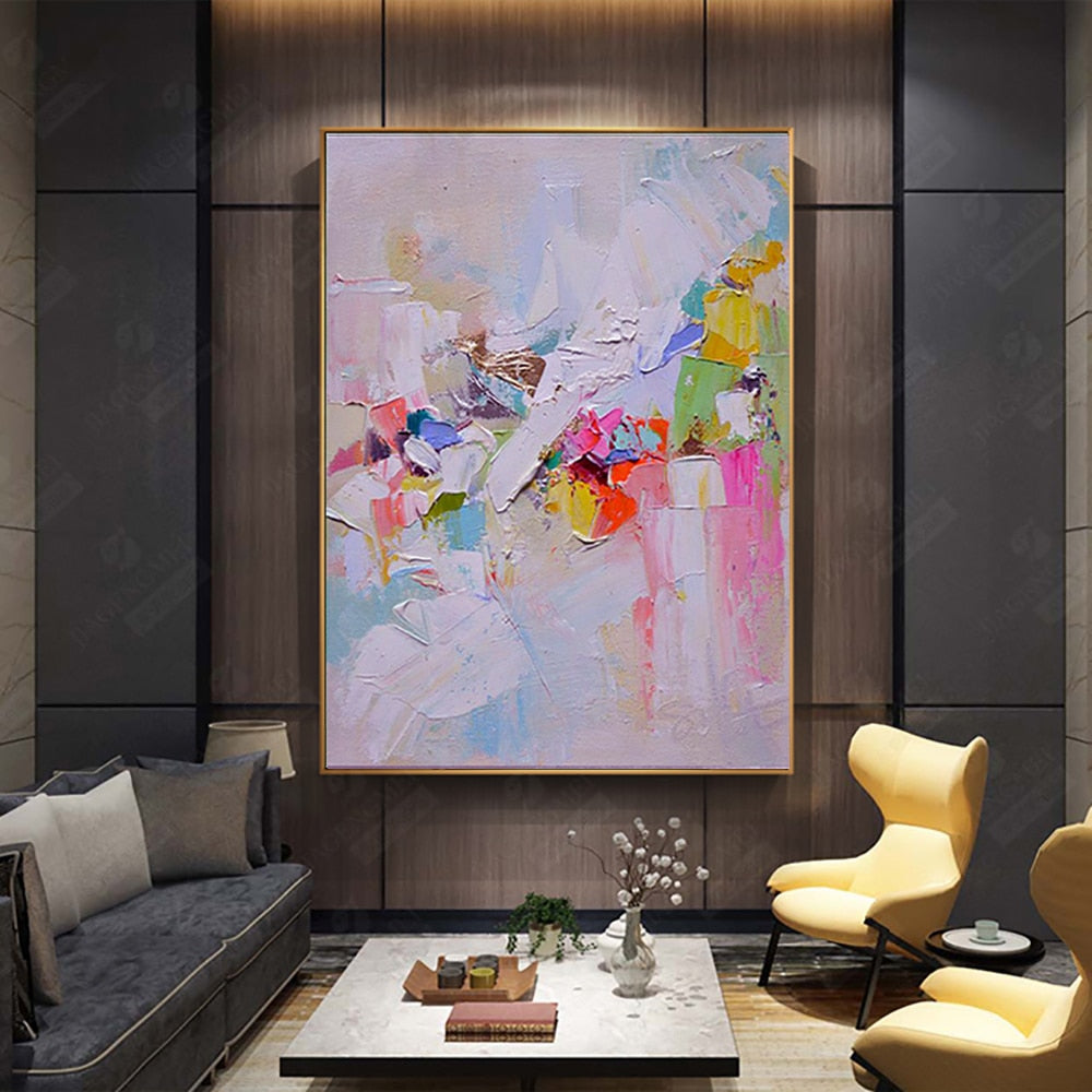
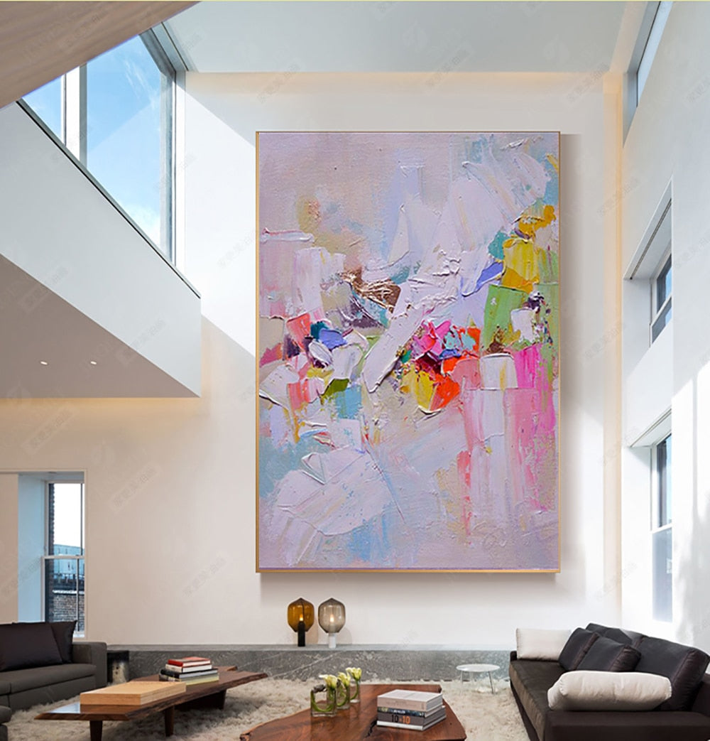
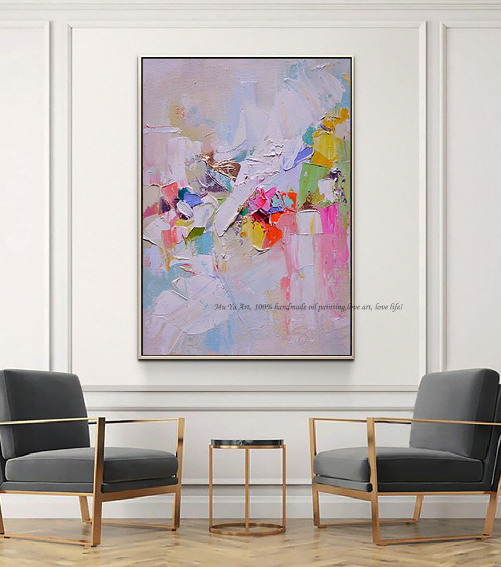
Step 4: Choose Scale That Supports the Room
Different styles benefit from different artwork sizes.
-
Minimalist interiors → Larger pieces with breathing room
-
Eclectic interiors → Medium groupings or gallery walls
-
Modern homes → Bold, oversized statements
-
Small apartments → One strong piece instead of many small ones
Scale influences how intentional the space feels.
Step 5: Let One Element Connect Everything
To create cohesion, let your wall art repeat one existing element:
-
A tone found in your rug or sofa
-
A shape seen in lighting or furniture
-
A texture similar to wood or fabric finishes
This subtle repetition ties the room together without looking staged.
Step 6: Avoid “Theme Decorating”
Matching art too literally (for example, beach photos in a coastal room) can make spaces feel predictable.
Instead, aim for interpretation:
-
Abstract landscapes instead of literal scenes
-
Color harmony instead of direct subject matching
-
Mood alignment rather than themed decoration
This keeps your home feeling sophisticated and timeless.
Step 7: When in Doubt, Go Neutral
If you’re unsure, choose art with:
-
Balanced contrast
-
Neutral palettes
-
Organic or abstract forms
Neutral artwork adapts to evolving interiors and won’t feel outdated as you update furniture over time.
Common Mistakes When Matching Wall Art
✖ Choosing art based only on color swatches
✖ Buying pieces that are too small to influence the room
✖ Trying to match every detail perfectly
✖ Selecting trendy art that clashes with existing furniture
✖ Overfilling walls instead of letting one piece lead
Good styling is about harmony, not duplication.
The Simplest Way to Get It Right
If you want a shortcut, follow this formula:
Look at your room → Identify its mood → Choose art that reinforces it → Scale it correctly.
That’s all designers really do.
Final Thoughts
Wall art shouldn’t feel like a risky decision.
When you choose pieces that align with your interior’s structure, tone, and scale, they naturally belong — making your home feel more intentional and complete.
The right artwork doesn’t just match your style.
It strengthens it.
Next Step: Discover how to select the perfect wall art size before buying so you never end up with pieces that feel too small or overwhelming.