
How to Create a Gallery Wall That Looks Designer-Made (Not Messy)
A gallery wall can make your home look curated and personal — or completely chaotic.
The difference isn’t the artwork.
It’s how you arrange it.
Many people hang pieces randomly, thinking more art equals more style. In reality, great gallery walls follow structure, balance, and intention.
Here’s how to build one that actually looks designed.
1. Start With a Clear Layout Strategy
Before hanging anything, decide your layout style:
Grid Layout
Perfect for modern and minimalist homes. Clean, symmetrical, calming.
Organic Layout
More relaxed and creative, but still needs an anchor point.
Linear Layout
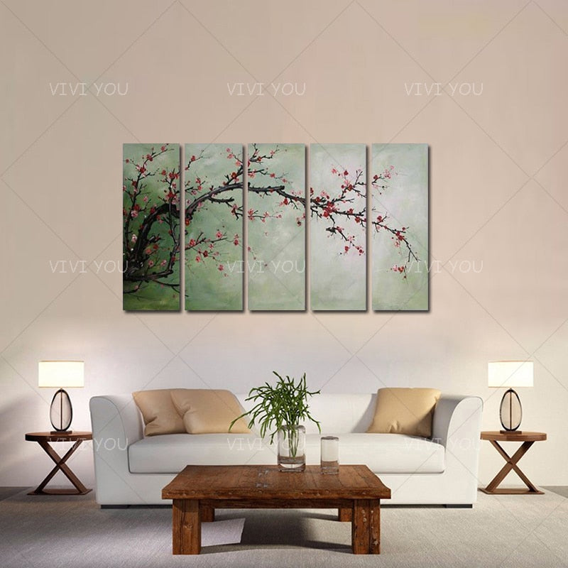
Best for hallways or above sofas — keeps everything aligned horizontally.
Choosing a structure first prevents visual chaos later.
2. Anchor the Wall With One Key Piece
Every strong gallery wall has a focal point.
This is usually:
-
The largest artwork
-
Or the most visually dominant piece
Place it slightly off-center or at eye level to ground the arrangement.
Then build outward from it.
Without this anchor, the wall feels scattered.
3. Keep Spacing Consistent (The Secret Most People Miss)
The gap between artworks should stay consistent across the entire wall.
Ideal spacing:
5–8 cm (2–3 inches) between pieces.
Too wide → disconnected
Too tight → cluttered
Consistency creates harmony even when artworks differ.
4. Stick to a Cohesive Color Story
Your pieces don’t need to match — but they must relate.
Choose art that shares:
-
Similar tones (neutral, earthy, monochrome, etc.)
-
A repeated accent color
-
Comparable contrast levels
Mixing random palettes is what makes gallery walls feel accidental.
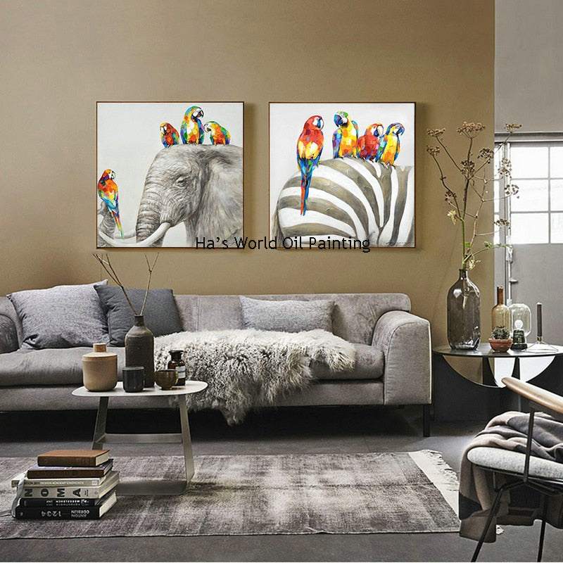
5. Use Size Variation — But Control It
A good gallery wall mixes sizes intentionally:
-
1–2 medium statement pieces
-
Several supporting smaller works
-
Avoid extreme size differences
If one piece is dramatically smaller, it will feel like an afterthought.
Balance matters more than quantity.
6. Plan on the Floor First (Never Skip This Step)
Lay everything out on the floor before hanging.
This allows you to:
-
Adjust spacing visually
-
Test balance
-
Avoid unnecessary wall damage
-
Photograph the layout for reference
Designers rarely hang art without pre-planning — and neither should you.

7. Align to an Invisible Frame
Imagine your gallery wall sitting inside an invisible rectangle.
Even organic layouts should stay within this boundary so the arrangement feels contained and intentional.
If pieces drift too far outward, the wall loses structure.
8. Match the Gallery Wall to the Furniture Below
Just like single artwork, a gallery wall should relate to what sits beneath it.
Width guideline:
The entire arrangement should span about 60–80% of the furniture width.
This keeps the wall visually connected to the room.
Common Gallery Wall Mistakes to Avoid
✖ Mixing completely unrelated art styles
✖ Ignoring spacing consistency
✖ Hanging pieces too high
✖ Expanding the layout over time without structure
✖ Choosing too many small pieces with no visual weight
A gallery wall should feel curated — not accumulated.
When Gallery Walls Work Best
They’re especially effective in:
-
Living rooms needing personality without clutter
-
Staircases or hallways where movement adds rhythm
-
Home offices for inspiration and visual interest
-
Dining spaces that need warmth without large statement art
In smaller apartments, they provide impact without requiring oversized canvases.
The Gallery Wall Formula
If you remember one thing, remember this:
Structure first. Art second.
Layout, spacing, and color cohesion matter more than how many pieces you use.
When done right, a gallery wall doesn’t just decorate — it tells a visual story.
Final Thoughts
Creating a gallery wall isn’t about filling space.
It’s about composing a balanced arrangement that feels thoughtful and calm.
Take time to plan, maintain consistency, and choose pieces that belong together.
That’s how you achieve the “designer-made” look.
Next Step: Learn where to place wall art in every room to maximize visual impact without overdecorating.