
7 Wall Art Mistakes That Instantly Make a Room Look Cheap (And How to Fix Them)
Wall art should elevate your space.
But when styled incorrectly, it can quietly downgrade the entire room — no matter how nice your furniture is.
The good news?
Most mistakes are easy to fix.
Here are the most common wall art errors — and how to correct them like a designer.
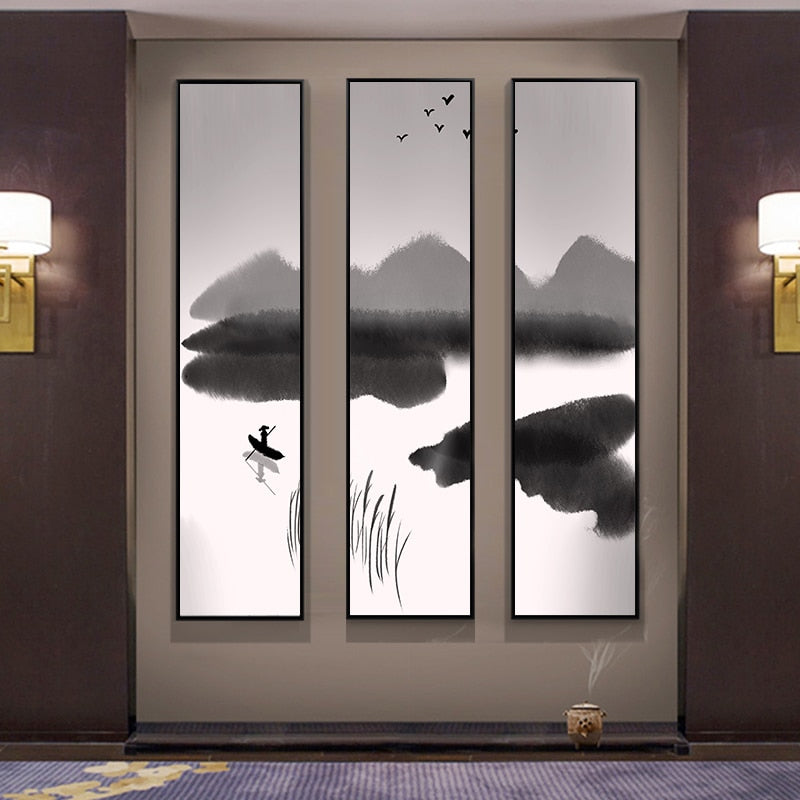
1. Hanging Art Too High
The mistake:
Artwork floating far above the sofa or bed.
Why it looks cheap:
It feels disconnected from the furniture and breaks visual flow.
The fix:
Hang artwork 6–10 inches above the furniture below.
Keep it visually linked to the piece it anchors.
SallyHomey’s proportion-focused designs make it easier to align correctly with standard sofa and bed heights.
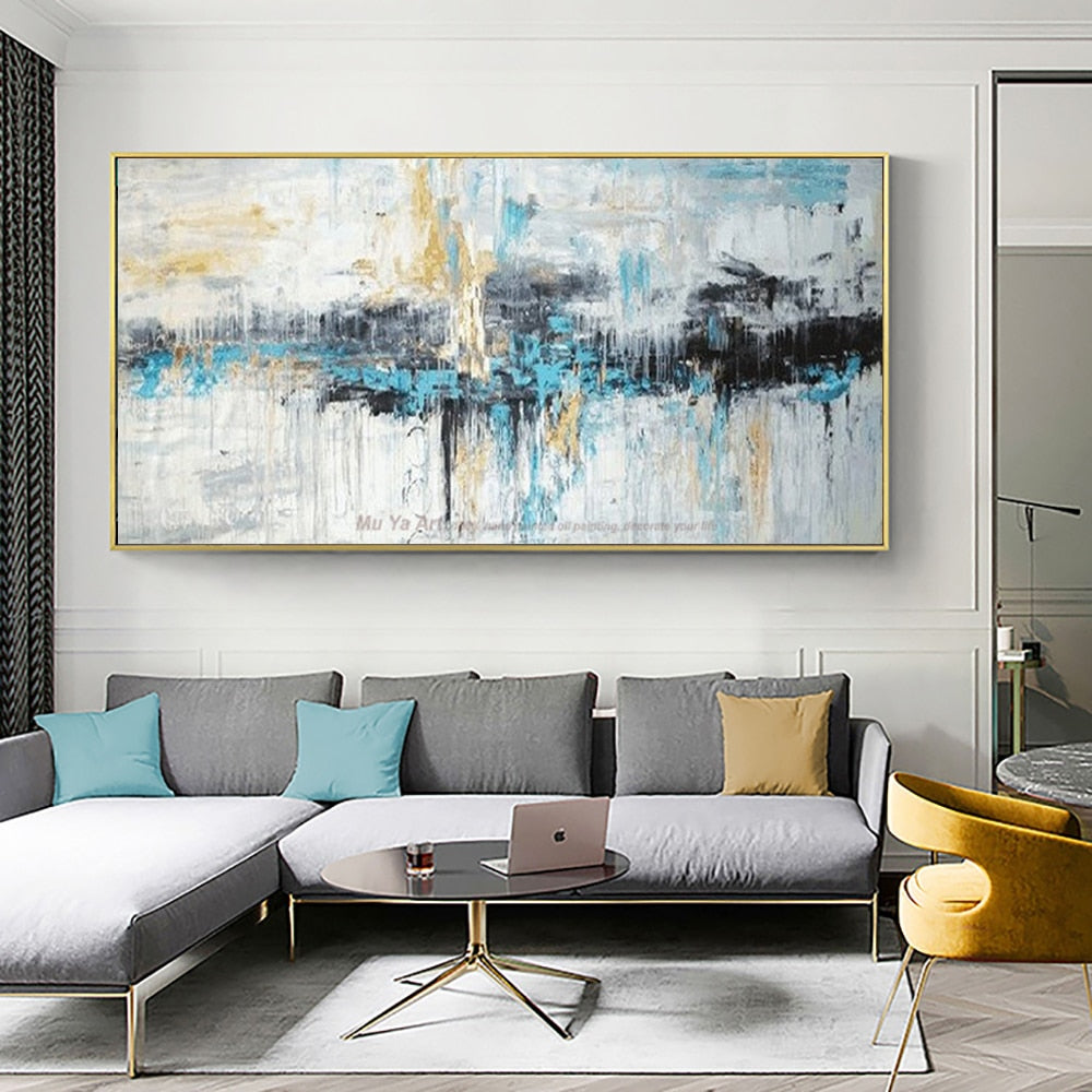
2. Choosing Art That’s Too Small
The mistake:
Tiny frames centered on large walls.
Why it looks cheap:
The wall feels empty. The art feels insignificant.
The fix:
Choose artwork that spans 60–75% of the furniture width.
When in doubt, go larger.
Statement-scale pieces instantly upgrade perception.
3. Overcrowding the Wall
The mistake:
Filling every inch with decor.
Why it looks cheap:
Visual clutter reduces sophistication.
The fix:
Embrace negative space.
Let one strong piece breathe.
Luxury interiors rely on restraint — not excess.
4. Ignoring Color Harmony
The mistake:
Artwork that clashes with the room’s palette.
Why it looks cheap:
It feels random and unplanned.
The fix:
Choose art that echoes at least one tone already present in the space — whether from the sofa, rug, or accent pillows.
SallyHomey collections are curated around modern neutral palettes to make coordination effortless.
5. Mixing Too Many Styles
The mistake:
Combining abstract modern art with ornate vintage frames and unrelated themes.
Why it looks cheap:
The room lacks hierarchy.
The fix:
Choose a dominant style.
Let supporting elements complement — not compete.
Cohesion creates elegance.
6. Poor Lighting
The mistake:
Artwork sitting in shadow.
Why it looks cheap:
Texture and detail disappear. The room feels flat.
The fix:
Add layered lighting:
-
Soft ambient light
-
Subtle accent lighting
Well-lit artwork feels intentional and elevated.

7. Treating Art as an Afterthought
The mistake:
Buying art just to “fill the wall.”
Why it looks cheap:
It feels generic.
The fix:
Select pieces that anchor the room’s design direction.
Think in terms of:
-
Scale
-
Balance
-
Presence
Not just decoration.
The Upgrade Formula
If you want your home to feel refined:
✔ Choose larger over smaller
✔ Respect proportion
✔ Leave breathing space
✔ Maintain color harmony
✔ Let one piece lead
Wall art should look integrated — not improvised.
Transform Your Space With Confidence
SallyHomey designs focus on architectural proportion, modern texture, and balanced composition — helping homeowners avoid the most common styling mistakes.
Instead of filling your walls, elevate them.
Browse statement-scale pieces designed to anchor your space properly — or explore our styling guides to refine every detail of your interior.
Next in this series: How to Style Wall Art Above a Sofa Like an Interior Designer.