
10 Wall Decor Mistakes That Make Your Home Look Cheap (And How to Fix Them)
A room can have beautiful furniture and still feel off.
In most cases, the problem isn’t what’s on the floor — it’s what’s happening on the walls.
Wall decor has the power to elevate a space instantly… or make it feel cluttered, unbalanced, and unfinished.
Here are the most common mistakes — and exactly how to fix them.

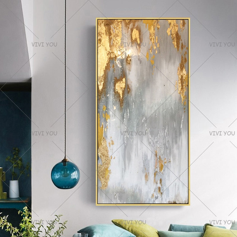
1. Choosing Art That’s Too Small
The mistake:
Tiny artwork floating above a large sofa.
Why it looks cheap:
It creates imbalance and makes the furniture feel oversized.
The fix:
Choose a piece that spans 60–75% of the furniture width below it. Scale alone can transform the entire room.
2. Hanging Art Too High
The mistake:
Placing artwork near the ceiling.
Why it looks wrong:
It disconnects the art from the furniture and makes the wall feel awkward.
The fix:
Center artwork at eye level (around 57–60 inches from the floor) or 6–10 inches above furniture.
3. Filling Every Inch of Wall Space
The mistake:
Overdecorating blank areas.
Why it feels cheap:
Clutter reduces impact and creates visual chaos.
The fix:
Let negative space frame your decor. Empty space makes what remains feel intentional.

4. Mixing Too Many Styles at Once
The mistake:
Combining ultra-modern prints with rustic farmhouse pieces and bold glam frames.
Why it confuses the eye:
There’s no cohesive visual story.
The fix:
Stick to one dominant style and allow subtle variations within it.
5. Ignoring Proportion to the Room Size
The mistake:
Medium-sized art in a large open space.
Why it fails:
The wall still feels empty, so you keep adding more.
The fix:
In large rooms, go bold. Oversized wall art grounds open layouts beautifully.
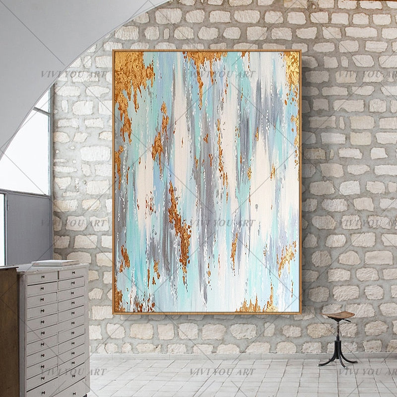
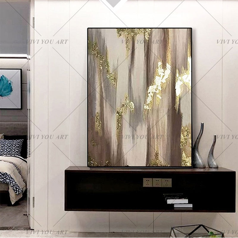
6. Using Only Flat, Mass-Produced Prints
The mistake:
Decor that lacks depth or texture.
Why it lowers perceived value:
Flat visuals can feel generic and temporary.
The fix:
Incorporate texture — layered tones, visible brushwork, dimensional canvas finishes. Depth equals richness.
7. Random Placement
The mistake:
Hanging art without aligning it to furniture or architectural lines.
Why it looks amateur:
It feels accidental.
The fix:
Align artwork with:
-
Sofa width
-
Console length
-
Window edges
-
Ceiling height
Structure creates harmony.
8. Overloading Gallery Walls
The mistake:
Too many small frames competing for attention.
Why it overwhelms:
There’s no clear focal point.
The fix:
Simplify. Replace multiple small pieces with one statement-scale artwork.
9. Ignoring Color Balance
The mistake:
Introducing art that clashes with the room’s palette.
Why it disrupts flow:
It draws attention in the wrong way.
The fix:
Repeat existing tones from rugs, pillows, or furniture inside your wall decor choice.
10. Decorating Without Intention
The biggest mistake of all:
Buying decor because the wall feels empty — not because it serves a purpose.
The fix:
Ask:
-
What mood do I want this room to create?
-
Should this wall feel calm, bold, grounding, or light?
Design starts with clarity.
The Difference Between Decorated and Designed
Decorated spaces add items.
Designed spaces edit.
Often, upgrading your home isn’t about adding more pieces — it’s about choosing stronger ones.
One well-scaled, intentional artwork can fix half the issues above in a single decision.
Ready to Upgrade Your Walls the Right Way?
If you’re rethinking your wall styling, start with proportion and presence. SallyHomey collections are curated around scale, balance, and modern simplicity — helping homeowners avoid common decorating pitfalls.
Explore statement wall pieces designed to elevate your space instantly, or continue reading our guides to refine your home step by step.
Next in this series: The Fastest Way to Upgrade Your Space Without Renovating.