
Why Scale Matters More Than Color in Home Decor
Most people obsess over color.
Should the sofa be beige or gray?
Should the art include warm tones or cool tones?
But here’s the truth designers understand:
A perfectly colored room with poor scale still looks wrong.
A well-proportioned room with simple color almost always looks right.
Before choosing shades and finishes, mastering scale changes everything.
1. The Eye Notices Proportion Before Color
When you walk into a room, your brain instantly processes size relationships:
-
Is the rug large enough?
-
Is the art too small?
-
Is the coffee table undersized?
Only after that does it register color.
If proportion feels off, no paint choice can fix it.
2. Small Art Is the Most Common Design Mistake
One of the fastest ways to downgrade a room visually:
Hanging artwork that’s too small for the wall.
Undersized art:
-
Makes ceilings feel lower
-
Makes furniture feel oversized
-
Leaves the wall feeling unfinished
Oversized art:
-
Grounds the space
-
Feels intentional
-
Creates balance
-
Reduces clutter
Scale builds confidence in a room.
3. Color Can Be Flexible. Proportion Cannot.
You can change pillows.
You can swap throws.
You can repaint.
But if your major elements are the wrong size, the space will always feel slightly off.
Designers start with:
-
Room dimensions
-
Furniture width
-
Ceiling height
-
Wall proportions
Then they layer color afterward.
4. Large Walls Need Visual Weight
Open-concept homes and taller ceilings are common in modern layouts.
Medium-sized decor often gets lost in these spaces.
If your room feels empty despite decoration, the issue is likely scale — not style.
Larger statement pieces:
-
Fill visual volume
-
Define zones
-
Anchor seating areas
-
Reduce the need for multiple accessories
Big rooms require confident choices.
5. Proper Scale Creates Instant Luxury
Luxury interiors aren’t always filled with expensive items.
They are filled with correctly proportioned ones.
Think about:
-
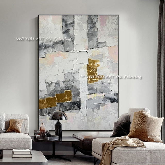
A large artwork above a sofa
-
A rug that fully fits under furniture
-
Balanced spacing around decor
When proportions align, the space feels composed and elevated.
6. The Simple Formula for Wall Art Scale
If you remember one rule, let it be this:
Artwork width should be 60–75% of the furniture below it.
This one guideline solves most imbalance issues instantly.
When art and furniture relate properly, the entire room stabilizes visually.
7. Color Should Support, Not Compensate
Many homeowners try to fix scale issues with bold colors.
But high contrast won’t solve imbalance.
Instead:
-
Choose proper size first
-
Then select tones that complement your space
Proportion creates structure.
Color creates mood.
Structure must come first.

The Real Foundation of Good Design
Great interiors aren’t built from trend choices.
They’re built from balance.
Before changing your palette, before repainting, before replacing furniture — look at scale.
Adjust proportion, and everything else becomes easier.
Want to See What Proper Scale Looks Like in Action?
Explore large-format wall pieces designed with modern room proportions in mind. SallyHomey collections focus on confident sizing that anchors furniture and elevates entire spaces without needing bold colors or excessive decor.
If your room feels slightly “off,” the solution may not be new paint — it may be better scale.
Browse statement-size designs or continue reading our styling guides to master proportion step by step.
Next in this series: How to Choose Wall Art That Complements Your Furniture (Without Matching Everything).